Case study
EcoTrip.
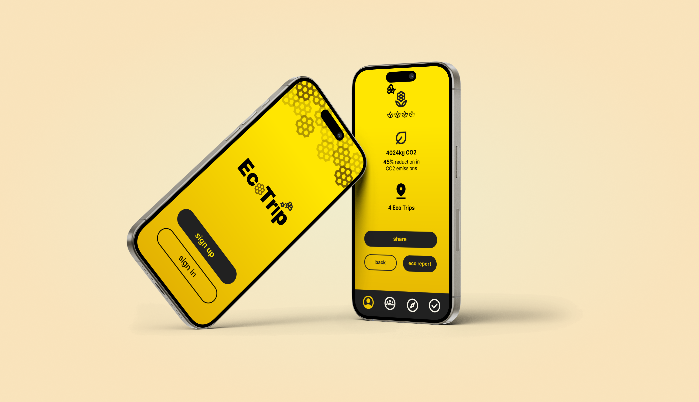
A bee-led travel companion that nudges greener trips and rewards better choices.
- Year
- 2024
- Type
- Mobile app
- Role
- Solo design
- Timeline
- 6 weeks
- Tools
- Figma · FigJam · paper
The problem
Sustainable travel apps either guilt-trip or feel performative.
The outcome
Course critique selected the rewards model as the standout.
Highlights
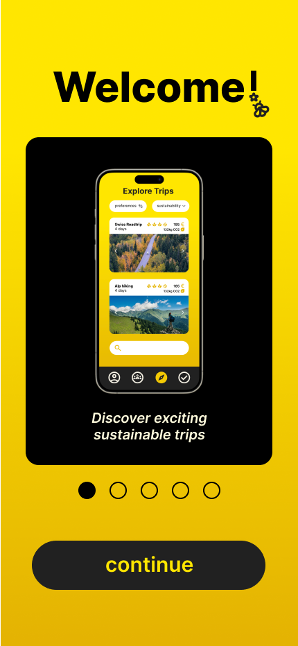
Onboarding — setting the posture before the first trip
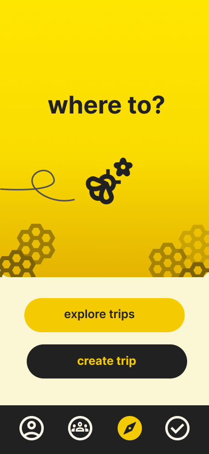
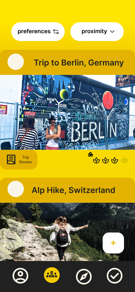
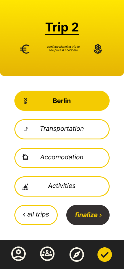
Start — explore others' trips or build your own
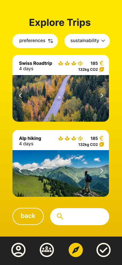
Explore — filter trips by preference and sustainability
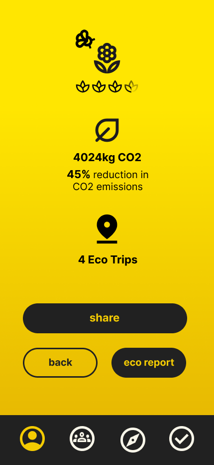
Community — see what others did, and how it scored
The problem.
Travel apps that push 'green' choices either moralise or feel like a sticker. I wanted a different tone — collective progress over individual sacrifice. Bees became the metaphor: a hive working together, small contributions visible at scale. This was a concept piece — the brief was a credible model, two personas, and an identity that didn't fall into the eco-green or SaaS-clean defaults. Production UI fidelity was deliberately out of scope.
The approach.
Step 01
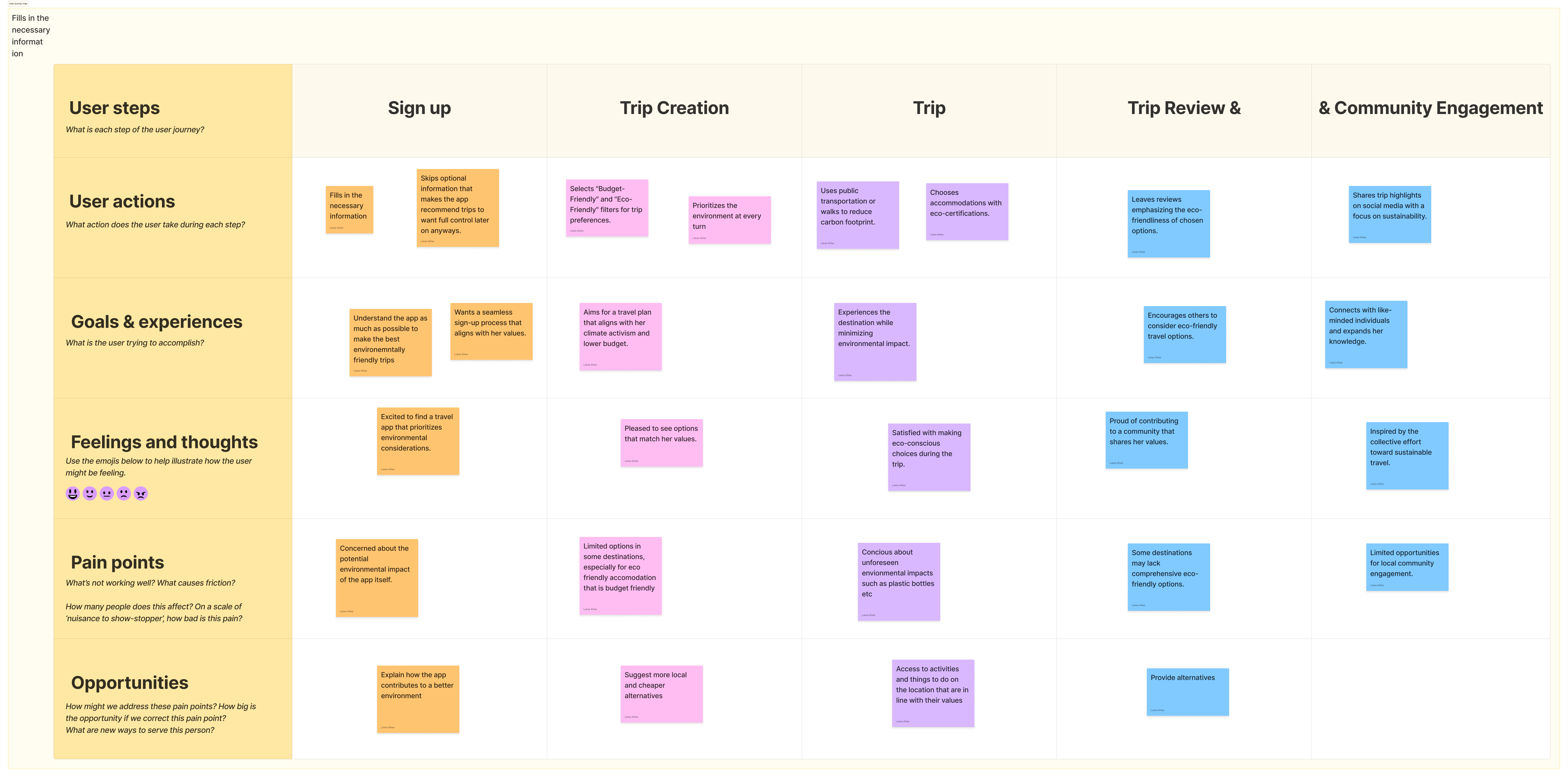
Designing for the activist.
Jane optimises every choice for footprint.
Jane — Edinburgh, lower budget, climate activist. Her mindset: reduce carbon at every step, even at the expense of comfort or the trip itself. Her journey told me where friction needed to live (on the unsustainable options) and where it had to disappear (on the sustainable ones).
Step 02
Designing for the casual.
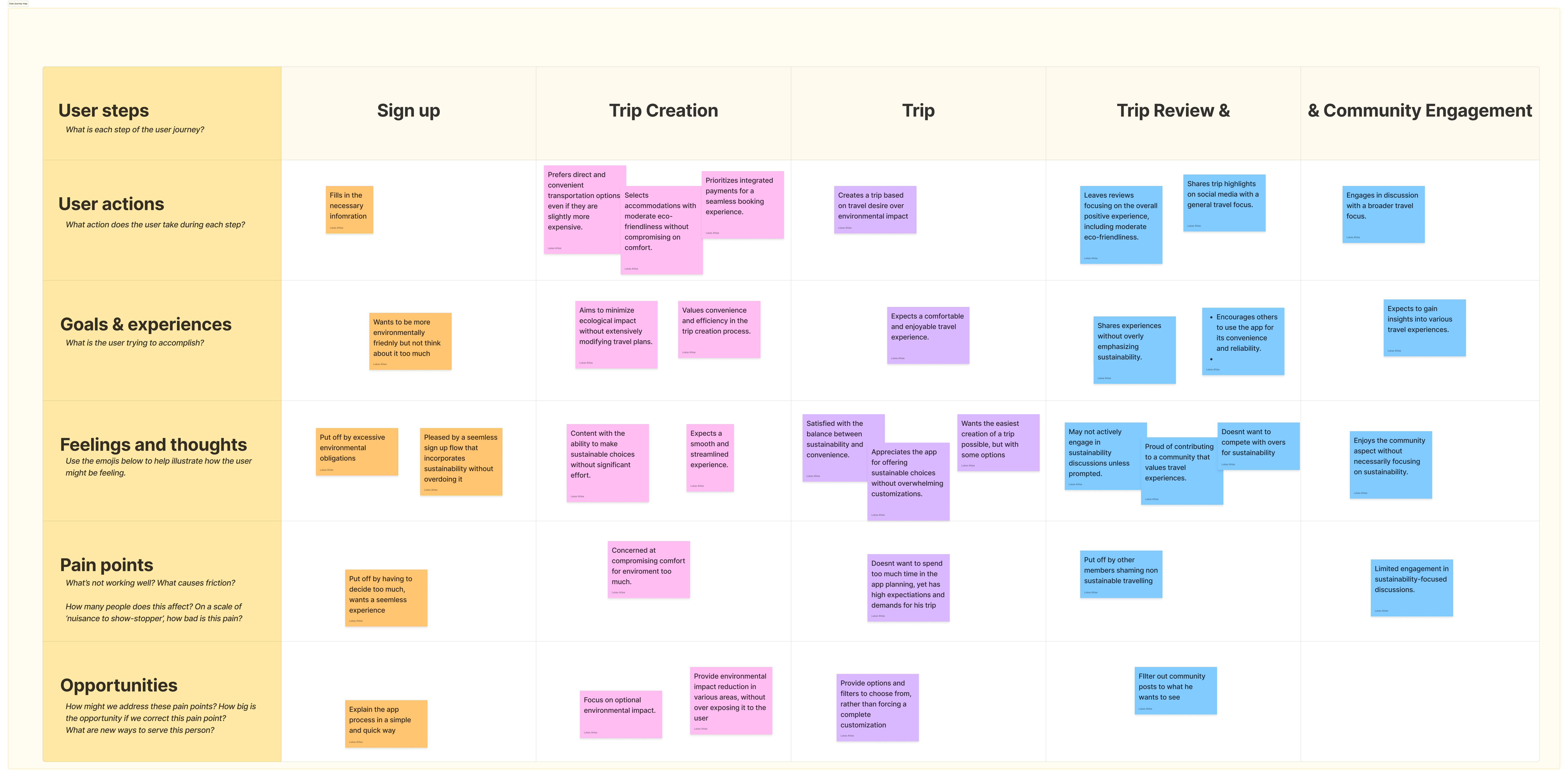
John wants peripheral awareness, not a lecture.
John — 43, bigger trips abroad, integrated payments, minimal customisation. He'll reduce his footprint where it doesn't take too much from the journey, and is willing to pay more rather than sacrifice convenience. His journey set the ceiling on friction: surface the green option, never block the path.
Step 03
Neither SaaS-plain nor eco-green.
The visual category was a trap.
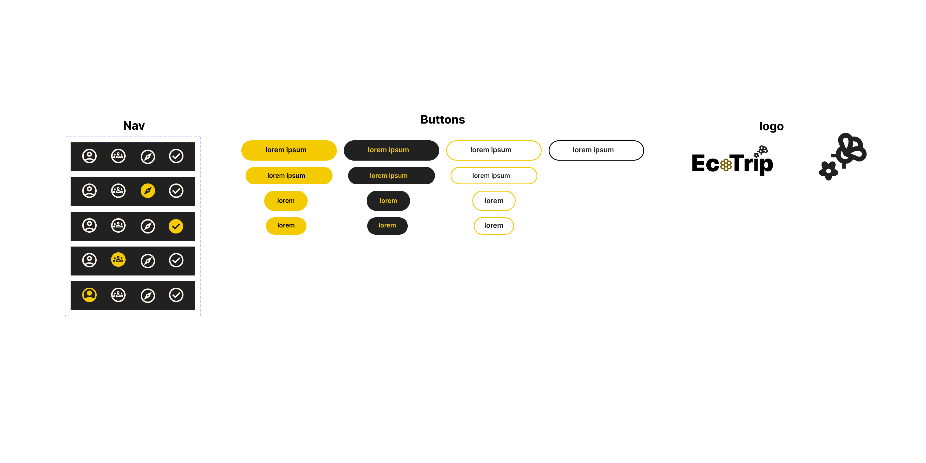
Travel apps default to SaaS-clean white and blue. Environmental apps default to green — virtue signalled at the palette level. Both felt off. The bees came out of that: warm, collective, focused on the hive's progress rather than any one person's halo. Honey gold and earthy tones replaced the predictable green; a rounded display family replaced corporate sans.
“Reward without moralising.”
The solution.
The outcome.
6 weeks
Concept to high-fi
The course critique selected EcoTrip's rewards model as its standout. Peers noted it managed to motivate without feeling preachy — the tonal goal worked.
3
Concept directions tested
What I’d do differently
The bee theme is strong but might alienate users who don't connect with it — I'd test a more neutral identity in parallel to compare adoption. The screens stop at concept fidelity too: a next pass would tighten interaction states, motion, and the visual hierarchy on the denser flows like Create and Profile.
Next case study