Case study
Teem.
Brand identity, packaging, and leaflet for a cold-brew matcha latte — a break from screens.
- Year
- 2023
- Type
- Brand & packaging
- Role
- Solo — full brand system
- Timeline
- 4–5 weeks
- Tools
- Illustrator · InDesign · Smartmockups · Chalkduster + Georgia
The problem
Matcha sits between coffee and tea — most concept brands stop at color and miss the story.
The outcome
A layered identity carried by Japanese imagery, type, and palette — not just hue.
Highlights
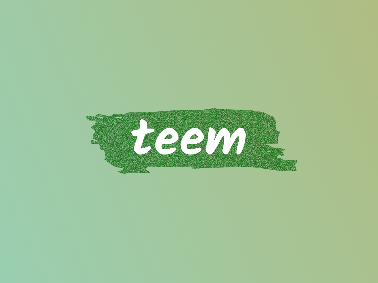
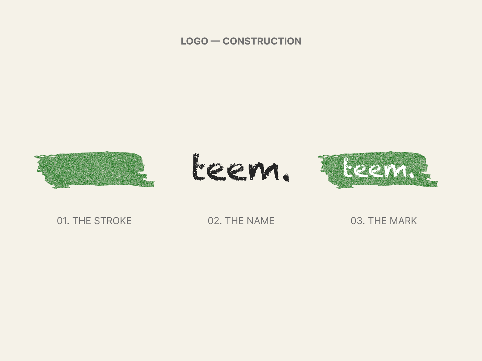
Logo on its green brushstroke — the brand mark in isolation
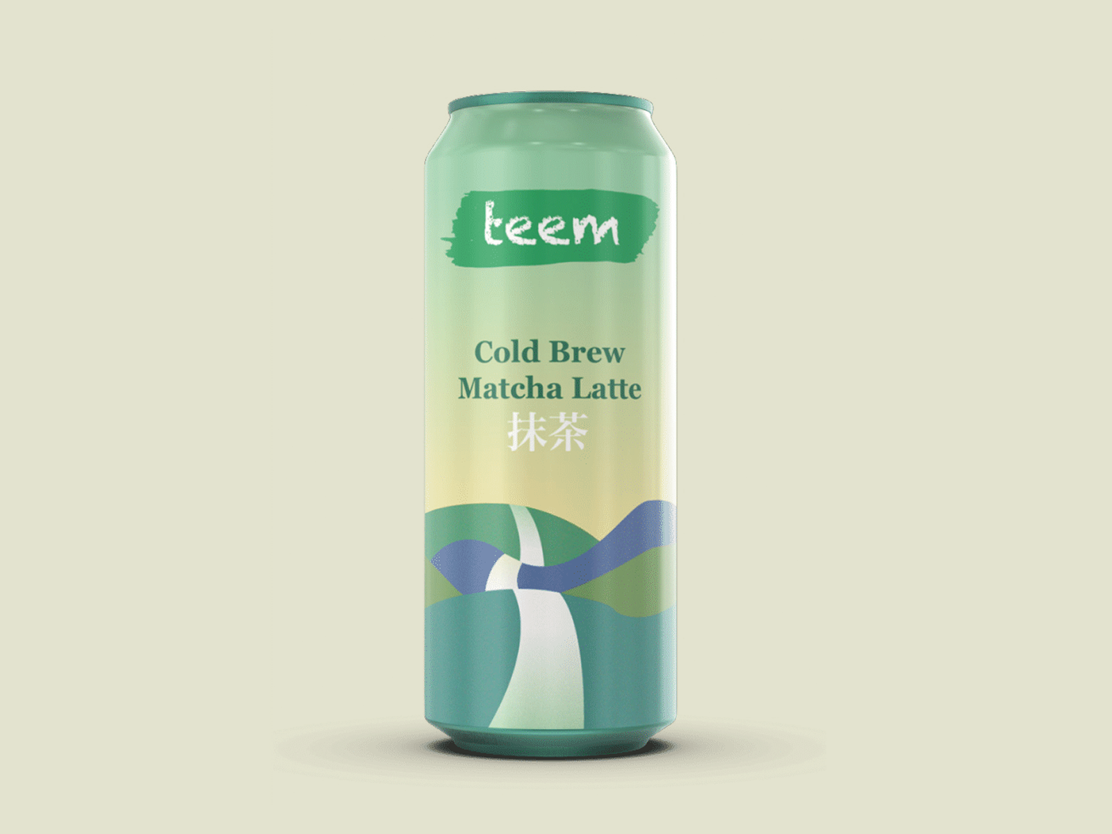
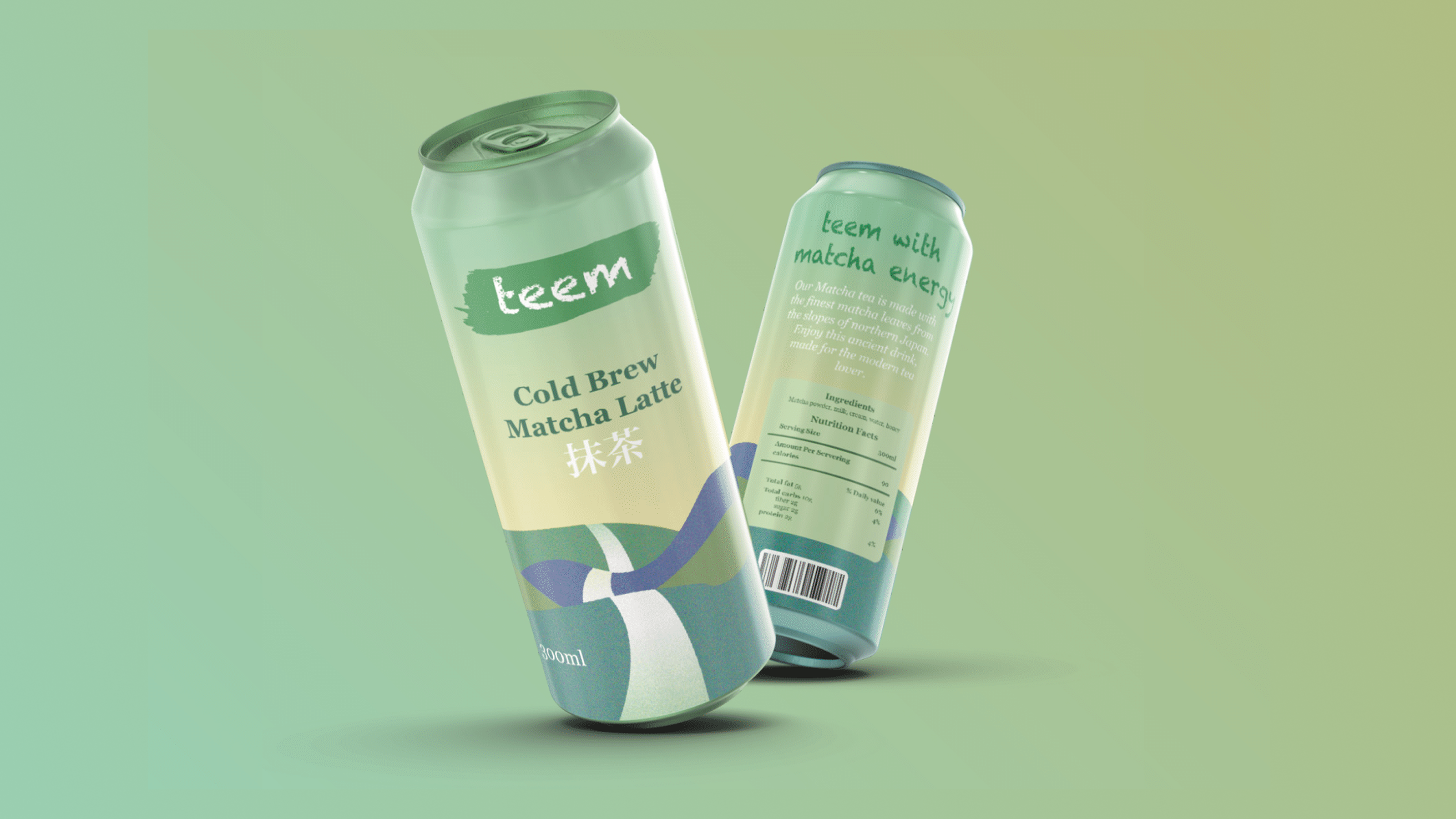
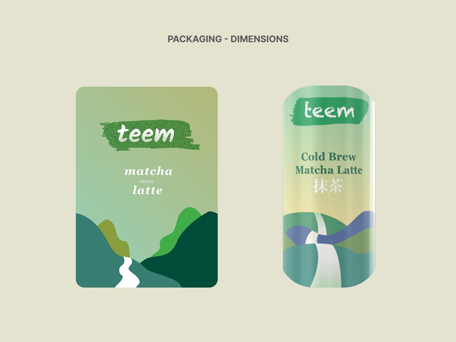
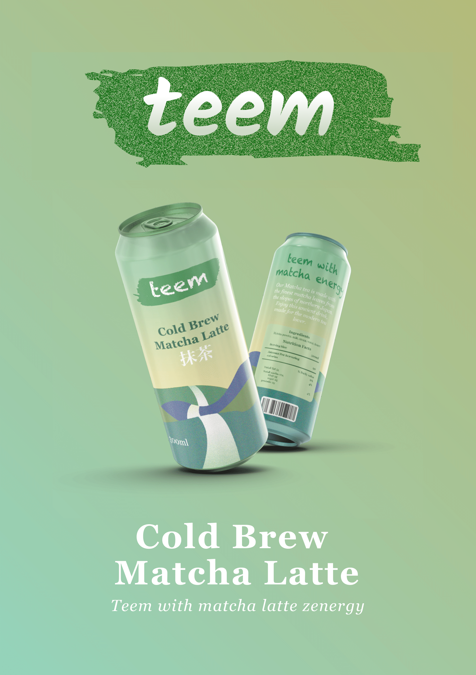
Can packaging — jade mountains and a white river
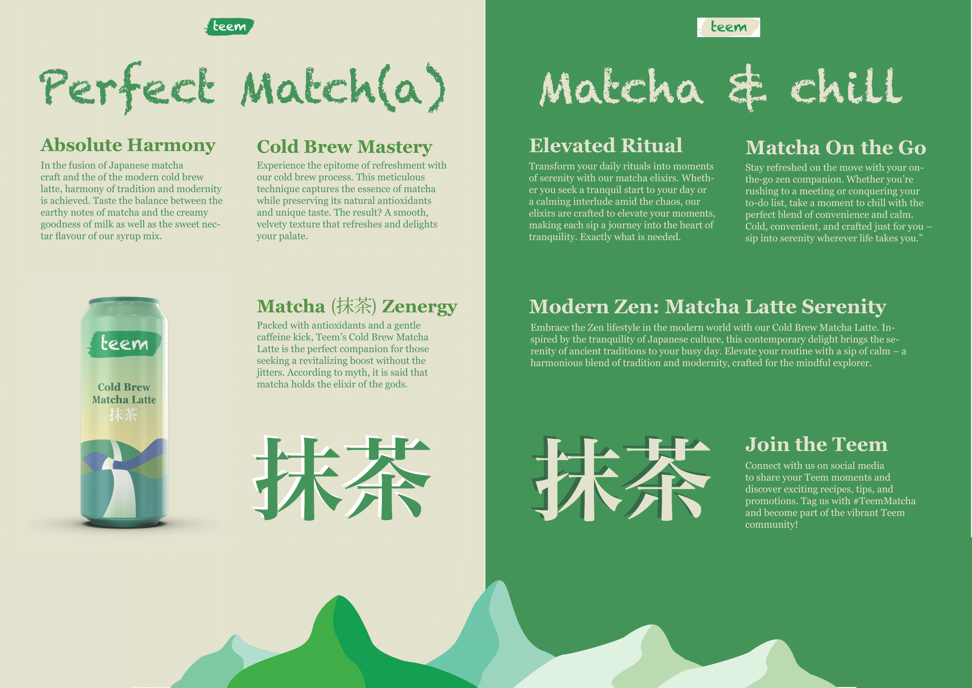
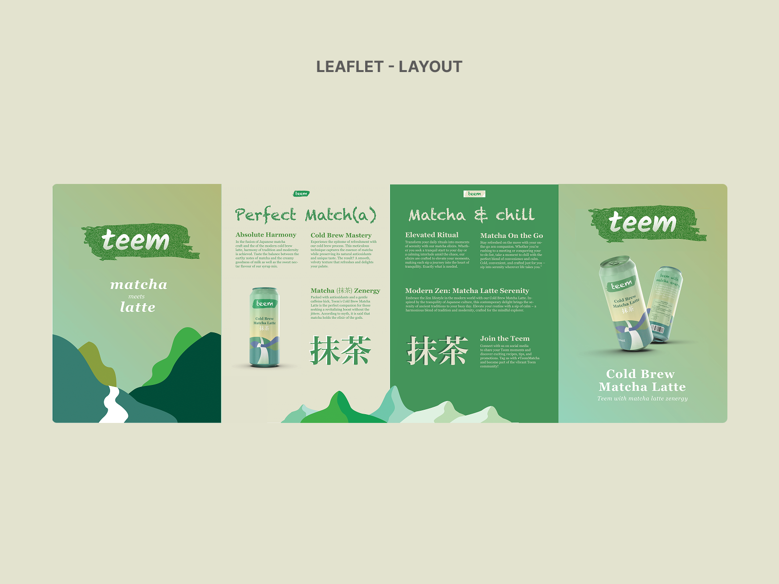
Leaflet article spread — two-column grid
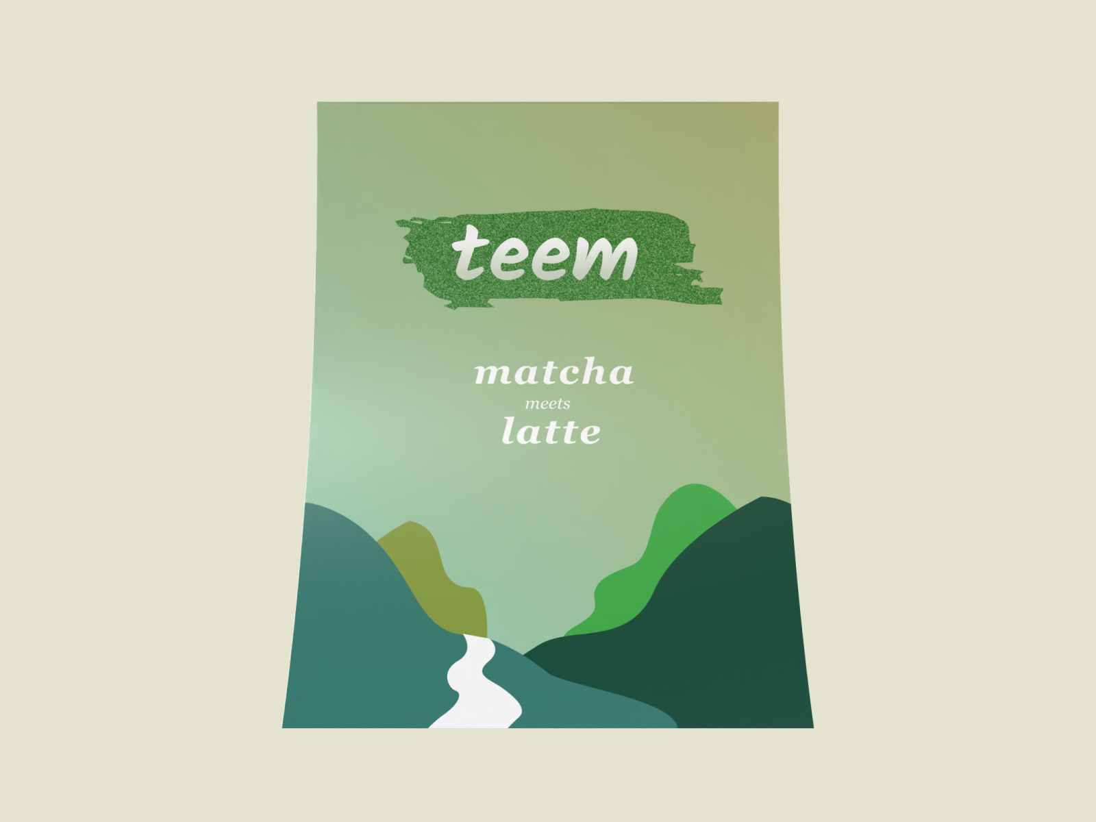
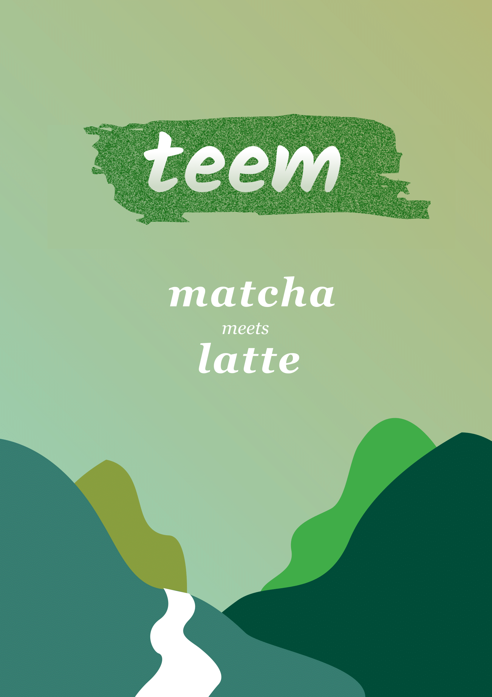
Leaflet front cover — matcha meets latte
The problem.
Matcha is going mainstream in the West. Most concept brands stop at color — a green palette, a minimal mark, done. The brief was a cold-brew matcha latte. The design problem: how does the brand carry both the tradition of Japanese matcha and the modernity of cold-brew café culture without flattening either?
The approach.
Step 01
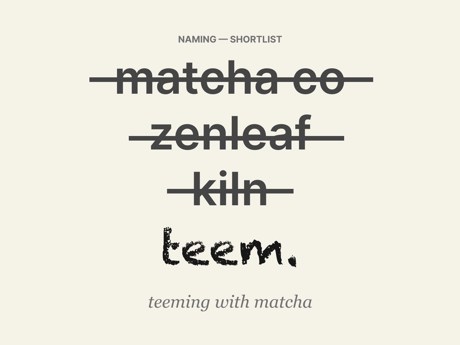
Name and concept.
Teeming with matcha, teeming with zen.
'Teem' suggests abundance and energy — a phonetic match for the drink's intent. Short, memorable, works in headlines and on a can.
Step 02
Logo and mark.
Chalkduster on a green stroke — modern street meets matcha craft.
A green brushstroke evokes matcha powder texture. Chalkduster's hand-drawn type adds a contemporary feel. Inspired by Nike's restraint: one mark, instantly recognised.
Step 03
Can packaging.
Curved cans break flat layouts.
Traditional Japanese imagery does the heavy lifting — jade mountains, a white river for the latte, the kanji for matcha (抹茶). Greens dominate but layered with blues and warm latte tones for depth. Multiple iterations to make it land on the curve, not just on a flat artboard.
Step 04
Leaflet system.
Four A4 pages, doubling as a newsletter.
Two-column grid for legibility, Chalkduster for catchy titles, Georgia for body. Carried the can's palette through with leaves added as a nature motif. Front cover, two interior article spreads, full-page back advert.
“Tradition meets modernity in every sip.”
The solution.
The outcome.
4–5 wks
End-to-end
A complete brand system that stays unmistakably matcha — greens dominate — but carries a layered visual story rather than a flat color identity. Jade mountains, kanji, blue and warm latte accents all do work alongside the green. The leaflet's restrained 2-column hierarchy landed cleaner than my first draft, which packed too much in.
1 brand
Name to leaflet
4 pages
Editorial leaflet
What I’d do differently
I'd prototype a physical can earlier. The first time I held the curve, I learned more in five minutes than two weeks of flat sketching had told me. For the leaflet, I'd push hierarchy harder — the iteration is cleaner but could be tighter still.
Next case study